
振鋒企業| YOKE
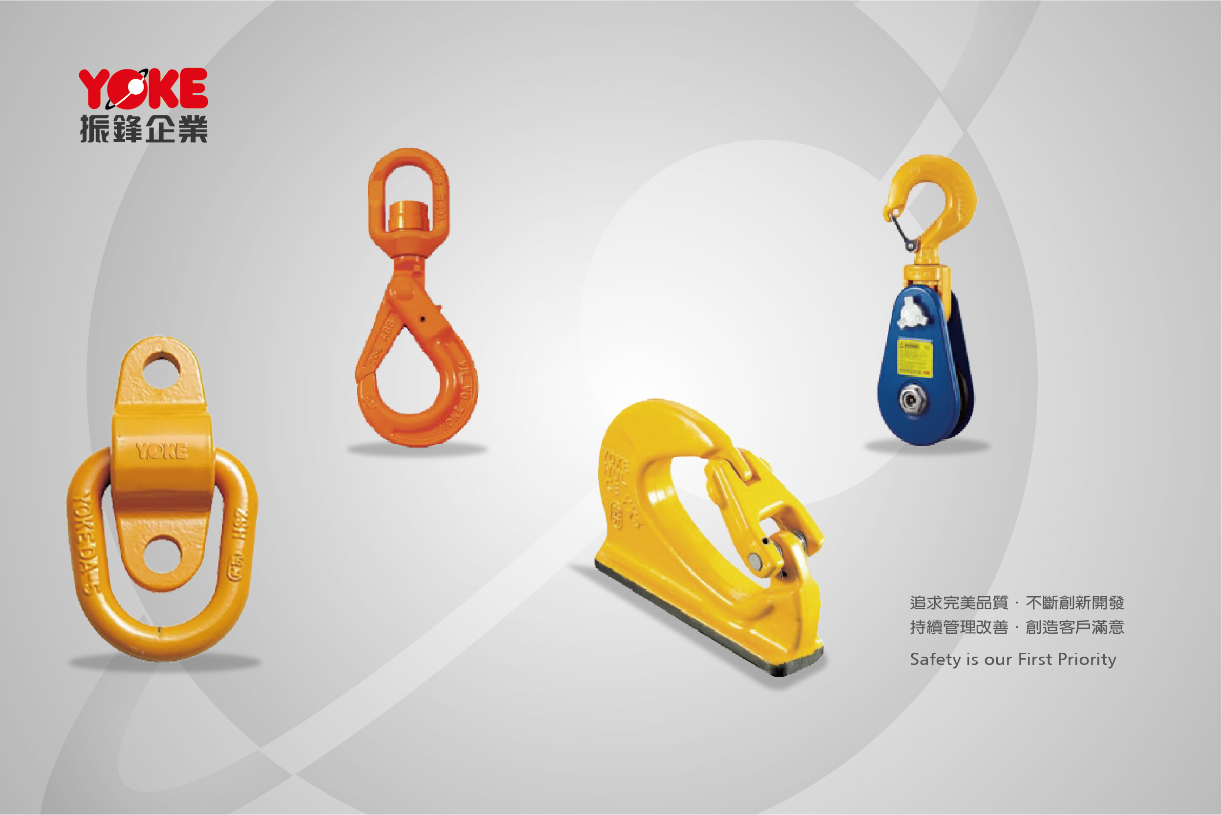
追求完美品質,不斷創新開發,持續管理改善,創造客戶滿意
Ssfety is our First Priority

華奧博岩 品牌識別系統 建構-振鋒企業

華奧博岩 品牌識別系統 建構-振鋒企業

華奧博岩 品牌識別系統 建構-振鋒企業

華奧博岩 品牌識別系統 建構-振鋒企業

華奧博岩 品牌識別系統 建構-振鋒企業

華奧博岩 品牌識別系統 建構-振鋒企業
華奧博岩 品牌識別系統 建構-振鋒企業

華奧博岩 品牌識別系統 建構-振鋒企業

華奧博岩 品牌識別系統 建構-振鋒企業

華奧博岩 品牌識別系統 建構-振鋒企業
品牌識別系統建構
● 設計服務項目
– 品牌設計 / 品牌識別系統 建構
– 企業形象識別系統
– 行銷策略導入
– 品牌策略導入
– 標誌要素設計
– 角色圖像設計
– 事務用品設計
– 公關推廣設計
– 產品包裝設計
– 企業外觀形象設計
– 展場空間設計
品牌識別設計理念
在工業起重安全鉤具產業中,首重產品器具的安全性,因此振鋒定位自己為銷售安全的公司,並以「追求完美品質、不斷創新研發、持續管理改善、創造客戶滿意」做為公司的經營理念。
品牌標誌的視覺設計以字母”O”設計出環繞行星的軌道圖形為主視覺,隱含品牌生生不息的概念,且具宏觀的視野、踏實的品牌精神。標準字設計則以圓潤沉穩的字型、及代表動力、生命力的紅色為主色調,搭配耀眼明亮的黃色,將其應用至事務用品及環境形象上,顯現振鋒屹立於吊重鏈條及鉤具的世界領導地位。
In the industrial lifting safety hook industry, the safety of products and appliances is the first priority. Therefore, Zhenfeng positions itself as a company that sells safety and takes “pursuit of perfect quality, continuous innovation and research and development, continuous management improvement, and customer satisfaction” as its The company’s business philosophy.
The visual design of the brand logo is based on the “O” orbit around the planet. It has a concept of endless life, a macro vision and a practical approach. The standard fonts are based on round and steady fonts, and red that represents power and vitality, combined with dazzling and bright yellow. This spirit is displayed in the image of office supplies and the environment, and it also shows that YOKE stands on the heavy chain and hook. Has a world leadership position.
公司介紹
● 公司名稱:振鋒企業股份有限公司
● 品牌名稱:振鋒企業
● 品牌類別:製造業
● 臺中市西屯區協和里工業區33路39號
● TEL:04-23508088


